The three new stations that make up the first phase the Second Avenue subway all have large platforms with wide stairways, escalators and elevators to help riders move in and out. But they also have notable differences that offer lessons on how to build better stations in the future.
Here is the great, the good, the bad and the ugly of the three new stations and the renovated 63rd Street station on the new Second Avenue subway.
GREAT: 72nd Street Station – Access and Art
If you want to be wowed by the design of the new stations, look no further than 72nd Street. While similar in size and configuration to the 86th Street station, the entrances at 72nd Street are located at the far ends of the platforms and do a much better job of extending the ridership shed of the station.

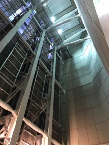
Exposed elevator shafts at 72nd Street station
The MTA’s inclusion of vibrant art in these stations helps connect them to their surrounding communities and makes them more inviting. 72nd street also contains the most impressive design elements of all the new stations. For the elevator bank on the southeast corner of 72nd , the MTA wisely kept the construction shaft whole and the workings of the elevators and structural elements exposed to the street level, creating a nearly 80-foot vaulted ceiling. The artist, Vik Muniz, complemented this by installing a playful “man on ladder” who is working on tiling the wall. I can imagine children being thrilled by this for decades to come.
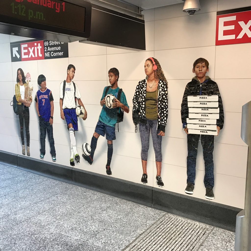
Muniz also is the artist behind “Perfect Strangers,” a series of mosaic renditions of average New Yorkers decorating the halls of the station. While adding color and humor to sometimes-bleak subway halls, the mosaics also are reflective of our times – one shows a woman fixated by her smartphone.

Vik Muniz’s “Perfect Strangers” at the 72nd Street station.

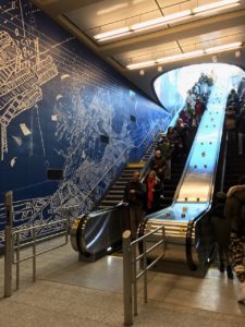
“Blueprint for a Landscape”
GOOD: 96th Street Station – No Sidewalk Entrances
The 96th Street station stands out because its large entrances are located in buildings or public plazas, instead of on crowded sidewalks. It’s a shame that pressure from businesses and communities prevented similar entrances at the other new stations.
Personally, I also like the artwork “Blueprint for a Landscape” by Sarah Sze – the station will be forever known as the “blue one.”
BAD: 86th Street and 2nd Avenue – Sidewalk Entrance at 86th Street
Not everything is bad at 86th Street. The station layout and artwork are appealing. Chuck Close’s “Subway Portraits” use an inventive technique that sharpens some of his more blurred mosaics when you view them through your phone’s camera - try it!
Unfortunately, other elements fall short. There are no exits to the western side of 2nd Avenue and 86th Street, a big gap at a major commercial corner. Furthermore, the exits that do exist on the eastern side of 2nd Avenue take up precious sidewalk space. Finally, the station has escalators, but only one elevator and no stairs from the crowded concourse level to the street.
UGLY: 63rd and 3rd Avenue – Elevators
Unlike the three new stations, the 63rd Street station was completed in the 1970s and was renovated for the Second Avenue line. Now that the station’s platforms are fully opened, the station feels much more spacious and the design connect it visually to the other stations further up the line. As a train buff, I appreciated the fun artwork by Jean Shin invoking the city’s rich transportation heritage.
Unfortunately, all but one of the entrances and exits on 63rd Street and 3rd Avenue take up narrow sidewalk space. The sole in-building entrance is situated in an older apartment building, instead of in one of the modern high-rises.

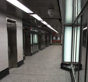
The four elevators servicing the 63rd St. station.
New Second Avenue subway riders also might be disappointed when they try to reach the platforms using the new elevators at the entrance. The new elevators offer a faster ride to the platforms from the concourse than the multiple escalators at the Lexington Avenue entrance. But they are undersized and lack clear organization for arriving and departing elevator passengers, a challenge throughout the MTA system. There are doors at just one end of the cars, with only four elevators to serve both the upper and lower level platforms. On several occasions, I’ve seen riders who were waiting at the upper platform grow impatient and board an elevator that was going down to ensure they got a space for its way back up. If the elevators were designed with front and back doors, the arriving passengers could be funneled out one side while those departing could enter through the other, similar to many elevator-reliant systems such as London’s Tube. If the MTA can find a way to facilitate the efficient inflow and outflow of elevator passengers, it could result in real time savings for riders getting in and out of the station.
LESSONS LEARNED
Overall the stations are well done and incorporate many modern amenities that riders have grown accustomed to in other transit systems. Yet there is always room for improvement. Major takeaways:
- Art is important. The MTA’s use of artwork here is excellent. This is a model that should be replicated for all new stations and when we rehabilitate old ones.
- Entrance design matters. Entrances should be located within buildings or off the sidewalk in pedestrian plazas, serve both sides of a street and provide stairs whenever possible. They shouldn’t obstruct sidewalks.
- Separating arriving and departing passenger flows may help circulation. The MTA should take advantage of new construction to either provide excess circulation capacity or separate passenger flows whenever possible to limit conflict. This is especially true for elevator- dependent entrances such as 3rd Avenue and 63rd
- Smoother and quieter subways make a world of difference. The MTA installed continuously welded and quiet rail on the line, which reduces noise in stations and improves ride quality. This technology should become standard and be installed throughout the system as part of the MTA’s regular maintenance program.
